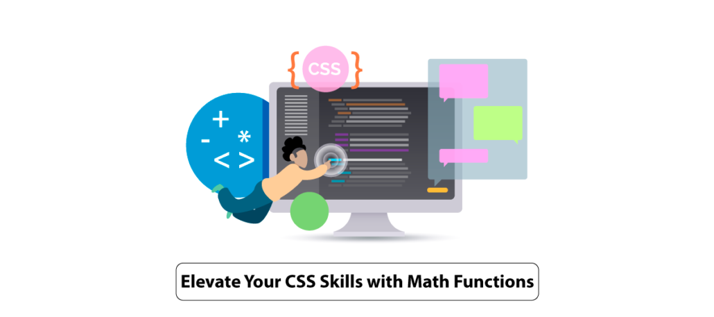
How to Use CSS Math Functions in Practice
Quick Summary: Do you want to learn how to use CSS math functions in practice? This article will show you how to use the calc, clamp, min, and max parts. We will also provide examples of how these functions can create responsive designs.
Introduction
Innovation is the key to success in this technological era. Harness the future of web design with CSS Math Functions!
These Functions offer an incredible leap forward. Additionally, These functions empower you to execute intricate calculations directly within your stylesheets, revolutionizing your approach to design. Imagine effortlessly resizing fonts, determining precise margins, or dynamically adapting element sizes with a single line of code!
This blog is your gateway to becoming a CSS Math Functions expert. It enables you to elevate your web designs to new heights. It also helps you to give Professional Frontend Development Services to your clients.
Keep reading!
What Is CSS?
CSS, or Cascading Style Sheets, is an important tool for web development, and its utility extends far beyond aesthetics. It’s not just about making web pages look pretty; it’s about enhancing user experience, optimizing performance, and simplifying maintenance. Let me convince you why CSS is crucial. And there are many Useful Topics In CSS.
Firstly, CSS empowers developers to control the layout and presentation of web content. This means you can create visually appealing designs that adapt to various screen sizes and devices. It improves accessibility and user engagement.
Moreover, CSS aids in achieving faster loading times by reducing page size through efficient styling. It also enables consistency across a website. It makes navigation intuitive and improves brand identity.
CSS is vital for animations, enabling eye-catching transitions and interactivity that captivate users. It also plays a pivotal role in SEO, ensuring your content ranks higher in search engine results.
What Is CSS Math Function?
CSS math functions are a powerful feature allowing you to perform mathematical operations within your Cascading Style Sheets. While this may not seem immediately persuasive, CSS math functions are a game-changer.
Imagine you’re designing a responsive layout and need to calculate dynamic values like margins, padding, or font sizes based on screen width or other factors. CSS math functions, like ‘calc()’, come to the rescue. They let you write expressions like ‘calc(50% – 20px)’ to create fluid and adaptable designs.
Now, let’s explore CSS preprocessors like Sass or Less. These tools take CSS to the next level, allowing you to use variables, functions, and mixins, including math functions, more effectively. This results in cleaner, more maintainable code and faster development.
Benefits Of Using CSS Math Functions
Using CSS math functions, such as calc(), offers several notable benefits in web development:
1. Dynamic Layouts
CSS Math functions enable you to create layouts that adapt fluidly to different screen sizes and content changes. Additionally, this flexibility is crucial for responsive design, making your website look amazing on various devices.
2. Precise Sizing
You can calculate precise sizes and positions for elements. Thereupon, it ensures pixel-perfect alignment and spacing. This level of control is essential for achieving the desired visual aesthetics.
3. Reduced Repetition
By using CSS math functions, you can avoid duplicating values across your stylesheets. Additionally, this reduces redundancy, simplifies maintenance, and minimizes the risk of errors when values need to be updated.
4. Mixing Units
CSS math functions allow you to mix different units, such as percentages, pixels, ems, or rems, in a single expression. In addition, this versatility is handy for complex styling requirements.
5. Improved Responsiveness
With CSS math functions, you can create styles that respond dynamically to user interactions or changes in content, enhancing the user experience.
Enhanced Readability
CSS math functions make your CSS code more readable and expressive. Instead of hardcoded values, your styles become more self-explanatory and easier for other developers to understand.
Use Of CSS Math Functions In Practice
Do you want to learn how to use CSS math functions in practice? In this article, we will show you how to use the calc, clamp, min, and max functions. We will also provide some examples of how these functions can be used to create responsive designs.
The calc() Function in CSS
CSS syntax: calc(expression)
The calc() method takes a single expression as an input and returns the result of that expression as the value. For adaptive layout experiences, the function calculates the dynamic width and height of the container.
We use the calc function when we have to arrange the elements in a specific value.
Let’s suppose we have three-element side by side and we want it a single row with a 20px gap in each element and obviously, it is responsive.
.calc-flex{
            display:flex;
            width:600px;
            height: 200px;
            justify-content: space-between;
            }
            .calc-flex div{
            background:#d367c1;
            max-width:calc(100/3 - 20px);
            width:100%;
            }
            <div class="calc-flex">
            <div class="item1"></div>
            <div class="item2"></div>
            <div class="item3"></div>
            </div>
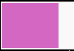
The min() Function in CSS
CSS syntax: min(value1, value2, …)
When using the min() function, the smallest acceptable value is specified. It accepts Two different specifications that are separated by a comma and support arithmetic expressions.
In the below example, Despite our container having a maximum width of 1000px, the div element inside our container cannot exceed 500px in width.
.min-check{
            width: 100%;
            max-width: 1000px;
            margin: 50px auto;
            justify-content: space-between;
            }
            .min-check div{
            background:#d367c1;
            width: min(50%, 500px);
            }
            <div class="min-check">
            <div class="item1"></div>
            </div>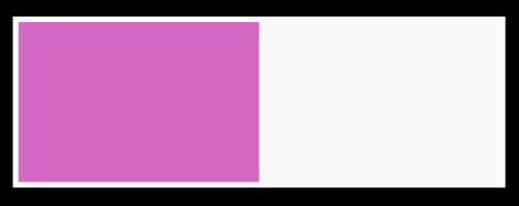
The max() Function in CSS
CSS syntax: max(value1, value2, …)
A max() function represents the largest value of one or more comma-separated calculations. We can use max() to set a minimum value for a variable.
When using responsive margins, the max() feature comes in handy.
.max-check{
            width: 100%;
            max-width: 1000px;
            margin: 50px auto;
            justify-content: space-between;
            }

            .min-check div{
            background:#d367c1;
            width: max(50%, 300px);
            }
            <div class="max-check">
            <div class="item1"></div>
            </div>
The container respects the width: 100%; however, it does not go below the stated 300px mark because it is the container’s greatest value.
The clamp() Function in CSS
CSS syntax: clamp(value1, value2, value3)
The clamp() function accepts three comma-separated expressions in the order of lowest value, preferred value, and maximum value as inputs.
Clamp() is most typically used to produce the effect of fluid typography by setting a range of allowable values for typography.
clamp() results of combining the min() and max() functions.
.item {
            width: clamp(300px, 50%, 1000px);
            /* Is equivalent to */
            width: max(300px, min(50%, 1000px));
            }
The CSS Math Functions in Practice is one of the most powerful tools in the toolbox for web designers. It allows you to do more than just a simple “+” or “-” to values and is able to do far more complex calculations. In this article, I’ll be going over how to use the calc function, as well as its sibling’s clamp, min, and max.
Conclusion
CSS Math Functions are your ticket to a brighter, more efficient, and visually appealing future in web development. As we wrap up, remember that innovation and adaptability are the keys to success in this ever-evolving field.
By harnessing the power of CSS Math Functions, you’ve gained the ability to craft websites with unparalleled precision. Your designs will adapt effortlessly to various screen sizes, ensuring a seamless user experience. The days of manual adjustments and countless media queries are behind you as you code smarter, not harder.
FAQ
What is an example of a function used as a CSS value?
An example of a function used as CSs value is the “rgb()” function, which simplifies a color using red, green and blue values.
For instance, “color:rgb(255,0,0):;” sets the text color to pure red; functions like this are common in CSS for various styling purposes.
How to use CSS commands?
The “translate()” function in CSS is an example of a function used as a value. It is used for transforming elements, such as moving them horizontally and vertically. Food instance, “transform: translate(50px,20px);” shifts an element 5o pixels to the right and 20 pixels down from its original position.
Why is CSS so tricky?
CSS is tricky due to its complexity and Quirks, it often involves cascading rules, inheritance, and a wide range of selectors. Inconsistent browser support and rendering differences can also cause issues. Additionally, maintaining a consistent layout across different devices and screen sizes are also challenging. CSS is powerful but requires a deep understanding to control layouts effectively, which can make it seem tricky especially for beginners.
Is CSS considered hard?
CSS can be considered challenging, especially for beginners. Its complexity arises from various factors like cascading rules, browser inconsistencies, and responsive design requirements. However, with practice and a solid understanding of its principles, CSS becomes more manageable, and experienced developers often find it less difficult to work with.
Can I make a calculator in CSS?
CSS alone cannot create a functional calculator. CSS is primarily used for styling and layout, while a calculator requires interactivity and calculations. To build a calculator, you’d need HTML for structure, JavaScript for functionality (handling user input and performing calculations), and CSS for styling. Combining these technologies allows you to create an interactive calculator that works in web browsers.


