
Introduction to Storybook with React
Quick Summary: This blog highlights the React storybook, focusing on its role in enhancing UI development through components, and helping developers create robust user interfaces.
Introduction
Tests and debugging become more complex with component-based UI libraries like React. React components are often interdependent and can break your application if you make a mistake.
The React Storybook framework lets developers create UI components in isolation by utilizing independent building blocks. In the current landscape, many custom react.js solutions use storybooks as a valuable tool. Its versatile capabilities streamline the development process.
In this blog, we will understand the concept of a storybook and provide you with a guide to hiring a React developer for your business. Here, you will understand the storybook purpose and learn how to begin using it effectively.
Setup
To include a storybook in your current react project, follow these steps:
- Npx sb init
The following modifications will be made to your local environment as a result of the command above:
- Install all of the necessary dependencies.
- Set up the necessary scripts for Storybook to run and compile.
- Activate the default Storybook settings.
- To get you started, add some boilerplate stories.
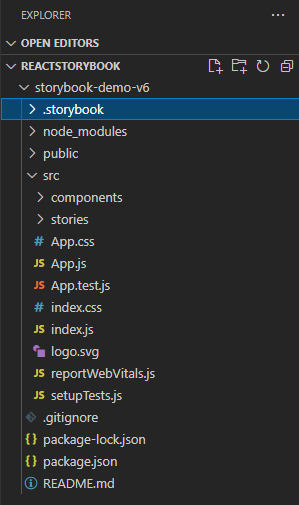
To run storybook :
- Npm run storybook
After running this command you can see a screen like below :

This is an introduction page for a storybook.
- The storybook extension can be .stories.js or .stories.ts or .stories.mdx
- The stories are written in Component Story Format (CSF)–an ES6 modules-based standard–for writing component examples.
Example
Let’s write one story to understand it better.
- Create one folder named components in src.
- In the components, the folder creates another folder named Button.
- Under the Button, the folder creates a file named Button.js/.ts/.mdx.
- Write following code in Button.js/.ts/.mdx file.
import React from 'react'
							import './Button.css'

							function Button(props) {
							const { varient = 'primary', children, ...rest }=props;
							return (
								<button className={`button ${varient}`} {...rest}>
								{children}
								</button >
							)
							}
							export default Button
- You can give CSS if you want. It’s optional.
- Now create another file named Button.stories.js/.ts/.mdx
- Write the following code in this file
import React from "react";
							import Button from "./Button";

							export default {
							title: 'Form/Button',
							component: Button,
							argTypes:{
								varient:{control : 'text'},
								onClick:{action:'clicked'}
							},
							}

							export const Primary = () => <Buttonvarient='primary'>Primary</Button>
So now, we have successfully created our first storybook. You can see this in your browser.
Features
Storybook comes with some built-in time-saving tools.
The toolbar contains tools that allow you to adjust how the story renders in the Canvas:
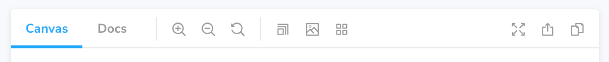
- Zooming graphically scales the component, allowing you to see its details.
- Background modifies the rendered background behind your component so you may see how it looks in various visual environments.
- Render the component in several dimensions and orientations by Viewport. It’s perfect for testing component responsiveness.
- Plugins that extend its fundamental capabilities are known as add-ons. You’ll find them in the add-ons panel, which is located below the Canvas in the Storybook UI. Each tab displays the metadata, logs, or static analysis created by the addon for the selected story.
- Controls allow you to interact with a component’s args (inputs) dynamically.
- Experiment with different component configurations to find edge cases.
- Actions allow you to use callbacks to ensure that interactions generate the desired results.
- For example, if you look at the Header component’s “Logged In” narrative, we can see that hitting the “Log out” button activates the onLogout callback, which is provided by the component that used the Header.
- Controls allow you to interact with a component’s args (inputs) dynamically.
- To take advantage of Storybook’s “args” idea, the above story definition can be modified further.
- Args is a machine-readable description of the arguments to Button.
- It enables Storybook’s superpower of dynamically modifying and constructing arguments.
- Here is one example of a storybook using “args” :
import React from "react";
							import Button from "./Button";

							export default {
							title: 'Form/Button',
							component: Button,
							argTypes:{
								varient:{control : 'text'},
								onClick:{action:'clicked'}
							},
							}

							export const Primary = () => <Button varient='primary'>Primary</Button>
							export const Secondary = () => <Button varient='secondary'>Secondary</Button>
							export const Success = () => <Button varient='success'>Success</Button>
							export const Danger = () => <Button varient='danger'>Danger</Button>

							const Template = (args) => <Button {...args} />

							export const PrimaryA = Template.bind({});
							PrimaryA.args = {
							varient: 'primary',
							children: 'Primary Args'
							}
Advantages
- Working on one component in one state (called a story) at a time is simple with Storybook. When you make changes to the Button code or stories, Storybook will re-render in the browser right away. There’s no need to manually refresh.
- The “Docs” tab displays auto-generated component documentation (inferred from the source code). When sharing reusable components with your teams, such as in a design system or component library, use docs come in handy.
- The Storybook can be expanded. Our extensive ecosystem of addons aids in the testing, documentation, and optimization of your stories. To meet your workflow requirements, you can alternatively design an addon.
- The story file is for development only and won’t be included in your production bundle.
Conclusion
In this article, we have understood the concepts of creating a storybook /React native components. After exploring Storybook’s possibilities, we can integrate it into our React projects as a component library. With Storybook js, developers and designers work in teams and can integrate with other front-end frameworks.
FAQ
What is storybook?
Storybook is an open-source development environment that aids in building, testing, and showcasing UI components in isolation. It eases streamlined development and collaboration by providing a dedicated space for visualizing components’ behavior.
How to use a storybook?
To use a storybook, install it via npm/yarn, define stories for your React components, and organize them within a stories directory. Run the storybook server to interact with the isolated components.
What is the meaning of storybook create-react-app?
Storybook create-react-app is a command that sets up a storybook within a create-react-app project. Furthermore, it configures the storybook to work seamlessly with the existing project, allowing for isolated component development and testing.
Give a react storybook example.
In the React storybook, you can create a button component story with various states and pros, like the primary button and disabled button, to visualize and test them separately.
Why do we use storybooks in React?
Storybook is a tool that helps create UI and test components in isolation. Furthermore, it operates outside the app, so project dependencies do not impact the component’s behavior.

