
Tableau – A Powerful BI Tool
Quick Summary: This blog highlights the significance of the Tableau tool in the business world and helps you understand how it is utilized for data visualization, analysis, and informed decision-making.
Introduction
Today’s data-driven world has made businesses heavily dependent on data analysis for making high-impact decisions and staying ahead in the market.
The purpose of Business Intelligence (BI) tools is to use raw data to generate valuable insights. Tableautool is one of the most powerful and versatile tools among the many BI tools available.
Businesses leverage the Tableautool to optimize decision-making and insights through data analysis and visualization using Python.
Partner with the best business intelligence services to leverage the abilities of Tableau in today’s competitive world. In this blog, we will highlight the use of the Tableautool and why businesses globally favor it.
What is Data visualization?
- When you are working with a large amount of data, it would be complex to understand, But you can better understand it by visualization.
- If you have one Office database with many records and want to find which employee in which region sells the maximum units of product, viewing documents in a table is a complex thing.
- Data visualization gives visual access to your data.
- It provides a well-defined overview of your data.
- It is mainly useful in making business decisions. Additionally, It helps you to make better decisions.
What is Tableau?
- Tableau Power BI is a data visualization software company focused on Business Intelligence. It is a visual analytics platform transforming how we use data to solve problems.
- It creates visualization, connects with data, and shares visual dashboards with other users.Hire tableau developers that are experienced enough to build and manage your analytics solutions for smarter decision-making.
- Tableau Desktop, TableauOnline, TableauReader, TableauPublic, and TableauServer are some of its products.
- Tableau Desktop:
- It has a rich feature set to create reports, charts, dashboards, and stories that can be either shared locally or publicly.
- Tableau Public:
- Workbooks cannot be saved locally. It should be saved to the tableau’s public cloud which can be viewed & accessed by anyone. There is no privacy in it.
- Tableau Server:
- The Tableau Server allows its users to organize, edit, share and collaborate on Tableau dashboards.
- Tableau Online:
- Its functionalities are similar to Tableau Server but the data is stored on servers hosted in the cloud which are maintained by the Tableau group.
- Tableau Reader:
- It allows users to view the workbooks and visualizations created by Tableau Desktop.
- Tableau Desktop:
A Tableau Tool Extension Files
- Tableau Workbook (.twb)
- It stores Workbooks(like worksheets, dashboards, stories, etc) with Datasource connection information(metadata) in it.
- Tableau Packaged Workbook (.twbx)
- It stores Workbooks along with local data(Datasource). This file can be shared with other Desktop.
- Tableau Data Source(.tds)
- It only stores connection details.
- Tableau Packaged Data Source(.tdsx)
- It is the same as the .tds file but it also stored data in it.
- Tableau Data Extract(.tde)
- It contains data used in the .twb file and stores aggregated calculations.
- Tableau Bookmark(.tbm)
- It contains a single worksheet that you can use in other workbooks by just pasting.
- Tableau preferences(.tps)
- It stores color preferences used across all workbooks.
Let’s start by making cool visualizations in Tableau Desktop
For that, you have to install Tableau Desktop software in your system.
When you open Tableau Desktop, you can see the following screen,
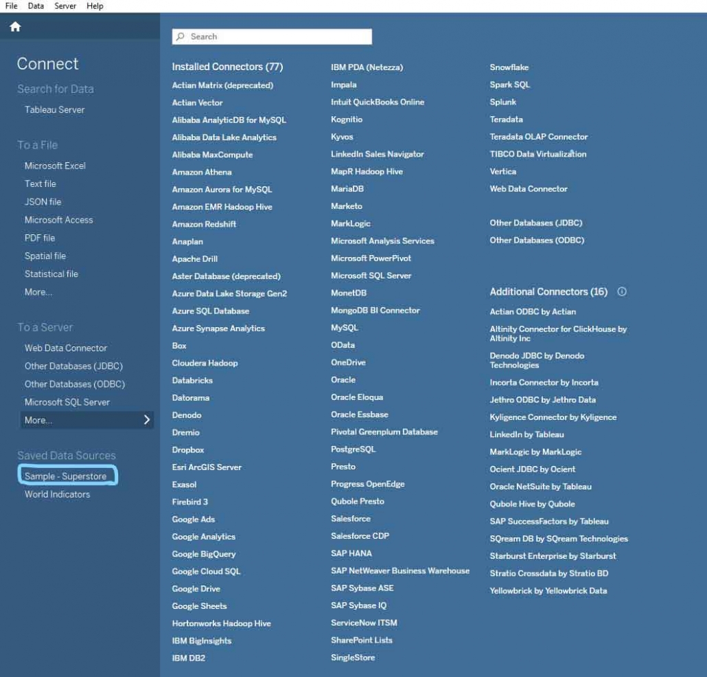
Tableau provides many options to connect with Datasource like files and servers.
Here I’m using Superstore Datasource that tableau provides for practice.
When you click on Superstore Datasource it opens a sheet like this,
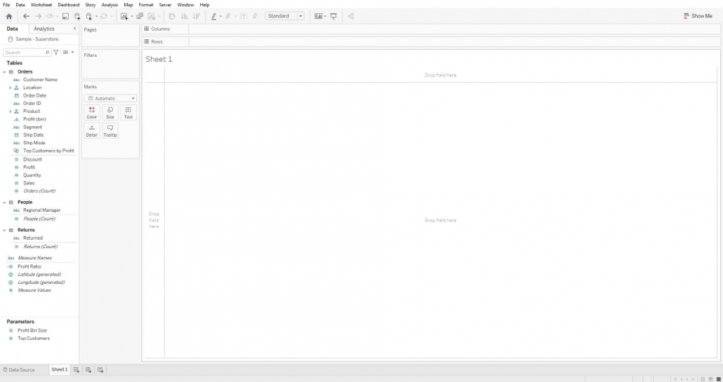
On the left shelf of view is Data Pane that shows Tables. There are three tables Orders, People, and Returns.
Fields are divided into two roles, one Dimension, and the other Measures.
Dimension: It represents qualitative data, like texts, geographical data, DateTime, etc. It is blue.
Measures: It represents quantitative data, like numeric fields. It is in green color.
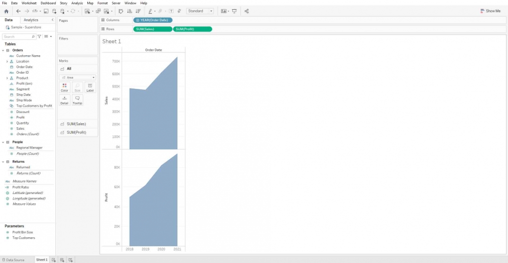
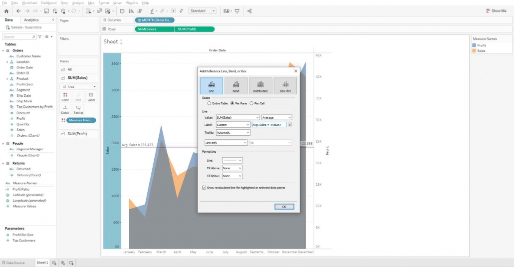
Create a Dual Axis chart of sales and profit by order date
For that drag sales and profits field and drop it to Rows Shelf. Also, drag Order Date to Columns Shelf. You can change mark type to any type you want from the Marks Shelf. Here I’m changing the marks type to Area.
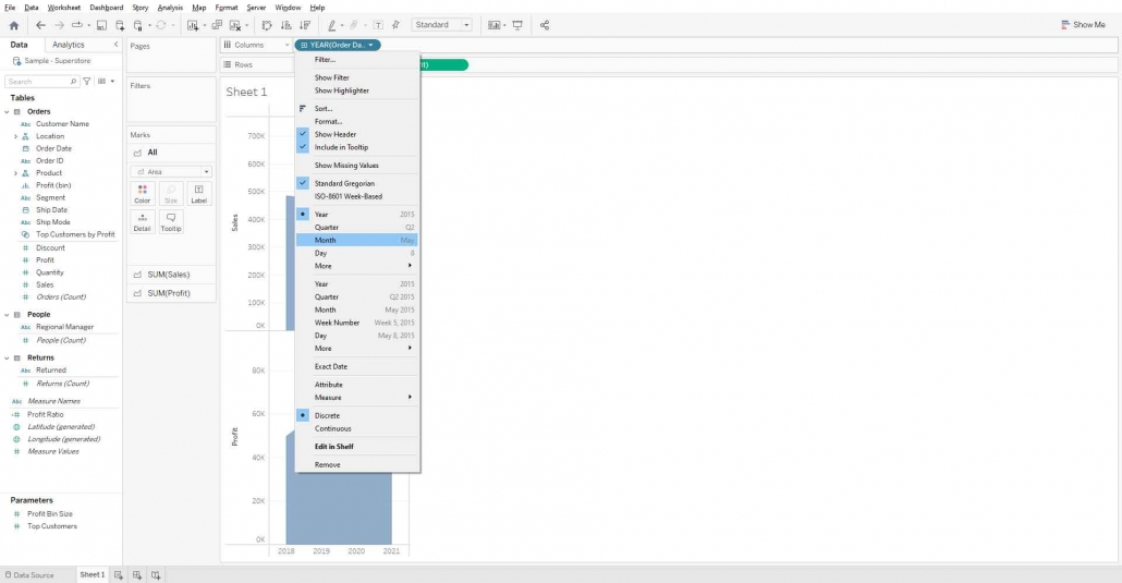
If you want to change the granularity of the order date, Click on the order date in the Column shelf and change the granularity to Month.
Right-click on the Profit axis and select Dual Axis and then again right-click on the profit axis and select Synchronize Axis.
You can hide the Profit axis if you want.
Bingo!! Dual Axis is ready that compares Sales and profit by month.
You can add a reference line on the sales axis and profit axis, here I’m adding an average reference line on the sales axis as well as the profit axis.
Right-click on the sales axis and select Add Reference line.
Change the label to custom and write Avg. Sales = <Value> in textbox.
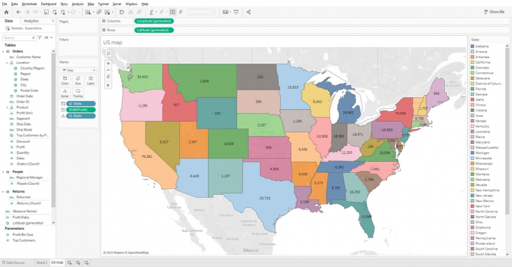
Create a Map of the US that shows the Sum of profit for each State
Drag the state field and drop it in view and change mark type to map. And drag the state to the color mark.
Drag Profit field to label mark.
If you want to visualize your bar chart in the tooltip of Map then click on tooltip mark > Insert drop-down > select sheets and now select the sheet that you want in your map tooltip.
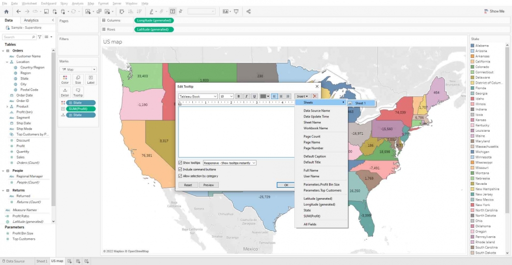
Hover any state, you can see the bar chart viewed on the map.

Conclusion
Once equipped with the Tableau tool, enterprises can have a different way of using data. It is equipped with essential real-time abilities and is quite easy to use with advanced visualization features that are important in decision-making in various sectors. Tableau in my opinion is the real muscleman of business intelligence in the age of information.
FAQ
Explain the difference between Power BI and Tableau.
Power BI and Tableau are both used for creating data visualizations. Moreover, Power BI is provided by Microsoft company, and Tableau is formed by Salesforce. Power BI is easy to use and it has some better Microsoft features and is relatively cheaper for small businesses. Tableau provides better and comprehensive functionality at an attractive price point for big companies.
Is Power BI similar to Tableau?
Power BI and Tableau are closely related; they are comparable and basically used in data analytics and reporting. Nevertheless, Power BI is created in Microsoft while Tableau is under Salesforce each with their different functions, features and integration.
Explain Tableau versus Power BI in terms of cost.
As Tableau requires bigger licensing fees compared to PowerBI it can be useful for the enterprises with bigger volumes of business. Lower costs with greater pricing flexibility reduce the overall expenses and make it very cost-effective for smaller businesses compared to Power BI.
Tableau vs. Power BI visualization: Which is better?
Tableau and Power BI are the two generally used visualization tools; however, the difference is in user tastes. The Tableau is a professionalized tool that works with more flexible visualizations; on the part of Power BI that is a user-friendly tool, which has a good integration with Microsoft products.
Explain the Tableau vs. Power BI: pros and cons?
Tableau Pros: The visualization of the data, the extent to which the system can handle the volume of data, and the analytical capabilities of the system. Tableau Cons: Not to mention the idea that it has a higher cost and a steeper learning curve. Power BI Pros: Included for free in your Microsoft account, affordable. Power BI Cons: Ease of use/lack of advanced options and flexibility.

