CSS Overflow Problems
Quick Summary: This blog discusses CSS overflow issues and offers solutions for creating outlines and techniques to tackle them effectively.
Introduction
In web development, Cascading Style Sheets (CSS) have a significant role in creating a website’s graphic and structural elements. There are challenges associated with CSS, even though it empowers developers to create stunning and responsive designs.
There are some challenges in dealing with overflow issues – cases in which the contents of a container exceed its confines.
This article aims to examine the complexities of CSS Overflow Problems, propose ways to create outlines and some important topics in CSS, and explore techniques for managing content efficiently and using CSS Math Functions.
What is Overflow?
An overflow issue occurs when the user unintentionally scrolls horizontally on a web page due to an unintentional horizontal scrollbar. Different factors can cause overflows to occur.
“When there is too much content for a box to contain, overflow occurs.”
Keywords You Can Use To Overflow
The overflow property can accept the following possible values:
div {
           overflow: visible | hidden | scroll | auto | inherit
        }
Visible CSS Overflow:
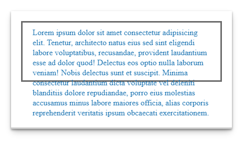
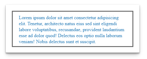
When the content leaves the boundary of its box, it is not clipped. This is the default setting of this property.
CSS:
.element {
          height: 100px;
          overflow: visible;
        }
Hidden Overflow CSS:
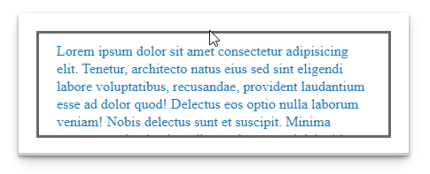
Content that is overflowing will be hidden.
CSS:
.element {
        height: 100px;
        overflow: hidden;
        }
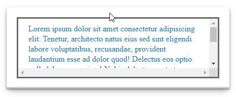
Scroll:

Hidden with the exception that users can move through the hidden content as they scroll.
Whether the content is long or short, the scrollbar is always visible.
CSS code:
.element {
          height: 100px;
          overflow: scroll;
        }
Auto:
Content is long
A scrollbar is visible
Content is short
A scrollbar is not visible
CSS code:
.element {
           height: 100px;
           overflow: auto;
        }
Initial: Displays the default value when visible.
Inherit: A value of the parent element set overflow.
Strategies to manage content overflow
Responsive design
To change they content based on users’ devices, you need to use responsive design techniques. Mobile ones will be under water less, as they are smaller and less-prone to overflow issues.
Media Queries
Media queries are particularities that allow designers to apply variations in the layout and style to scale in the size of different screens. Content shall not be pushed onto the simply every screen of smartphones and tablets this way.
Flexbox and Grid Layouts
Fluid designs are an easy thing to achieve with CSS Flexbox and Grid – the tool that adapt reacting on different content and device screen size. This flow organizational design itself controls overrun(or exceeding) without losing its aesthetic.
Text Overflow
If the content exceeds the width of its container, the text-overflow property, combined with white-space: – In case the sentence contains an excessive number of words, the platform automatically nowraps it.
Advanced Techniques
Scroll Snap
CSS Scroll Snap is a technique that empowers developers over the way that the scrolling moves content and makes it accurately align even when scrolling.
Custom Scrollbars
Although it does not emerge satisfyingly worldwide, custom scroll bar styling will, in fact, increase aesthetics and operation of overflow containers.
Z-Index Management
The z-index property when utilized in the right way presumes not to have wrong overlaps when working on the interconnected content and overflowing.
How Bigscal Helps?
Bigscal excels as the best front-end development service, adeptly tackling CSS Overflow Problems challenges. With our expertise, we master complex overflow issues, ensuring seamless and excellent user experiences for web applications. Connect with Bigscal if you need assistance in front-end development.
Conclusion:
CSS overflow issues could be regular missteps caused by web developers and designers working across a website. Yet, armed with a solid grasp of the overflow property and having learned a few other techniques, it is wholly possible to control content overflow successfully.
Outlines through container objects and appropriate overflow values not only exist to keep design aesthetics and user experience you have been searching for but these are also important in maintaining them. Adding responsive design, Flexbox and Grid layouts to your arsenal, as well as considering the use of advanced techniques for Scroll Snap results in a good wrap up that solves the overflow problem and keeps the display of your page outstanding.
While the digital space is becoming more complicated day by day, therefore, in this era, those developers can create outstanding sites that can cope up with content overload using these techniques.
FAQ
What is overflow in CSS?
A CSS element overflows when its content doesn’t occupy its entire container. Several elements can have specified heights that are too small for their content. CSS Overflow Problems allow you to control what happens to overflows.
What is overflow-x?
When a block-level element overflows at its left and right edges, overflow-x in CSS specifies whether a scroll bar should be added, the content should be clipped, or the overflow content should be displayed. The overflowing content on the page can be displayed horizontally using this property.
What is overflow-y?
Overflow-y is a CSS property that controls the vertical overflow behavior of an element’s content when it exceeds its defined dimensions, enabling scrolling if necessary.
What is an overflow value?
The Overflow is a situation in which the ideal value exceeds the range of the output type, so this case is classified as an overflow. Overflow classification may be delayed until after rounding for operations with well-defined rounding behavior.
What is overflow with example?
Overflow in CSS refers to how content is displayed when it exceeds its container’s dimensions. For example, “overflow: auto;” adds scrollbars when content surpasses a box’s size, ensuring a neat presentation.

